Without my scatterbrain behavior totally taking over, i did say i would post the latter of the sketches that i did in creating the concept for NIghtwing and show my sketchy versions of the Batmobile. I don’t have time to do that today… and it’s been awhile since ive posted any real art.
I decided that i would go the “process” route, first. A ton of people may want to know what it’s like to get into the comic business. It’s a weird time. Things are going digital and a lot of people are trying to find out how they fit in or how they can fit in. So they’re creating their own ways to put themselves out there. It’s literally the Gold Rush in th new frontier minus the horses, cowboy hats, chaps… then again, this IS the comic crowd… 😀 and bad teeth.
That all may be another discussion. But what if you want to know what the process is being in it already? It’s not an easy job. You’re designing on the fly, you have crazy deadlines and you sit a lot. You have to make it a purpose to get away from the table as much as you can and still get your deadlines done. You’re in the zone and then you get an email or a call. It’s your new potential editor. He/ She wants you to do a cover and then the interiors of a book that needs to be out soon. SO what’s the process?
ONE: They tell you what they want. They give you a summary of what is needed on the cover to sell the book. Something snazzy. Something that will pop off the shelf. Something that will make them not regret calling you in the first place. And then, if you’re an older artist, and been in the mix for awhile, let them know you haven’t lost a step. Maybe even picked up a new step or two in your journeys. Time to show them off. The editor gives your reference, and sometimes a tiny sketch of a stick figure of an idea to get you jumping off.
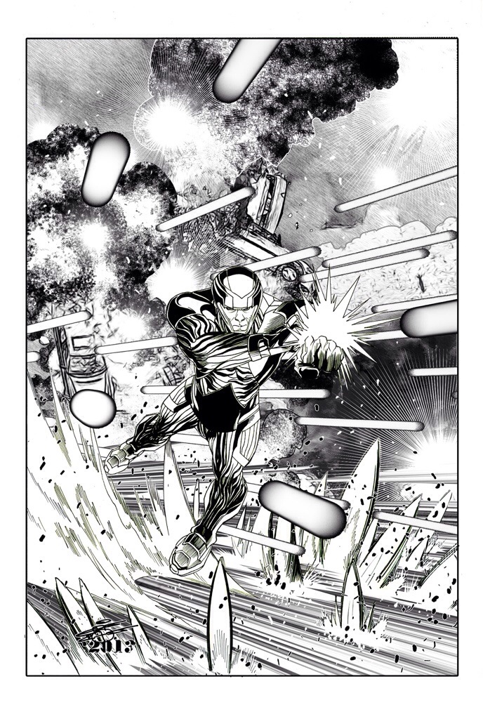
TWO: You do a quickie sketch.. a series of thumbnails that will give them something to imagine. In my case, it’s the Green Lantern Annual cover. I did come up with one or two, but lucky me, they liked the version i did the first time. Went for dynamic and looked for areas to draw your eyes and still give a ton for the colorist to do.
Understand: colorist or COLOR PAINTERS nowadays are very proficient in what they do. Talk to your colorist. Love your colorist. Send them flowers… Dom Perignon, cheesecake. This breed of artist will make you or break you. Especially if you’re inking yourself. You have a plan, you’d better let them in on it and leave them alone. You tick them off and they’ll lick all over your paper and still get paid LAUGHING. 😀
THREE: Send in the thumbnail and wait for approval. In the meantime, go wash some clothes, cook something, stretch, go the the gym or love your partner because it can take from 5 minutes to a day to get an answer back and you’re going to need some time to yourself. WHen the email comes in to GO FOR IT, you’ll have a limited amount of time to get it done. SO…
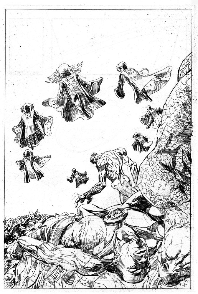
FOUR: MY PROCESS: i draw the accepted thumbnail and flesh out the cover in blue pencil. It’s the necessary process that i love but inkers hate. Nothing ticks them off more than having to erase blue waxy material off after they’ve done fine inking. I solved that in later steps. After i blue it on the paper, i go back in and hit it with the 2H. All the linework, all the line thin to thicknesses, all the shadowing goes into this stage. And since i’m inking i don’t care what i do, i can always fix it in Photoshop. So that’s done. Only indications are made to create sfx. Like trees or leaves or ground textures, or energy burst or whatever. That will either be posted on the page in Photoshop after i pencil or after i ink. It all decides on what i need to do.
FIVE: SCANNING. Every artist in the industry by now should have a scanner. If you don’t, you should be flogged with a wet towel. It saves on redoing things, it’s easier for the wallet… keeping you away from FedEx, USPS or any other courier, and once on your desktop, you can import the image into any application as long as you know what you want and what you’re doing.
Me, the image goes into Photoshop. I darken the image and use the paths to use controls in the appy that will help me get rid of the excess blue lines. I usually hit the level controls, and hit the graytone slider and play with it until i get the darkness ‘i’m looking for. It’s important because once i turn it into blue line, everything has to be there. I then go the Saturation slider and pull it way over to the max turning the blue pencil areas into glowing blue oversaturated color and then slide the Hue bar until i turn it yellow. Once it’s a light color, it’s easy to pick out the color without worring about what’s going to show once you go blueline.
Only hit the brightest colors that muck up the page. Never the darkest. unless you know what you’re doing. Trust me. It’s a hassle to have to touch up and refix any lines that you render away once you to that. Go to the Adjustment path and find the Replace Color Path and use the dropper to snag the color you wish to lighten. there’s a percentage slider at the bottom. 87% is the best.
Why? Cuz i said so. And i’ve done it for years. IT’s the number that pays to play.
Then hit the okay button and watch the magic. Just keep playing around with it until you get the most of the color you don’t need without totally washing away your linework. It’s a thing you have to practice.
Once done…
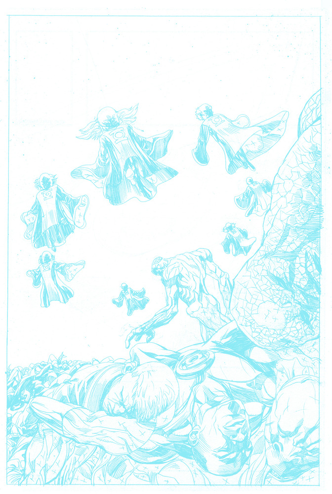
SIX: BLUE LINE…. By this time, you’ve cleaned up your work and hit it back to grayscale. And then RGB. Yes. RGB. WHY? cuz i say so. Hey, it’s my technique. Stop arguing.
Now by this time, i’m rummaging through a ton of images i’ve altered and collected and created from scratch. Rain, clouds, Trees and building backgrounds( For when i really need to step up the pace…. far away shots to add to already drawn scenes—inkers really thank me for that) Whatever i need to do to make it look really visual without it looking like the computer took it over. I have NO problem using computer images in my work. NONE. It’s all tools, people.
Don’t let anyone tell you different. If i must use my Mom’s Bostonian accent, “Wuhk Smahdduh, Naht Hahdduh!”
Whatever amount of layers it takes to make that happen.. like in the images below, i created a storm in the space firmament and put some cool burst effects on top of it and popped that “screen” mode to really marry the images. Then it was a bunch of carving out the images around the drawn figures, but when it was done… over the blue lines, i collapsed it and printed it out on legal 11×17 art board with DC guides in blueline and black and white sfx.
DC guides?
Oh yeah, i scanned those too. Just in case of emergencies and i need to use my own paper.
Oh yeah, DC gives you free paper. Marvel does too. In fact, any comic publication sends paper along with the script and vouchers. Keep that in your head for when you get in, mate.
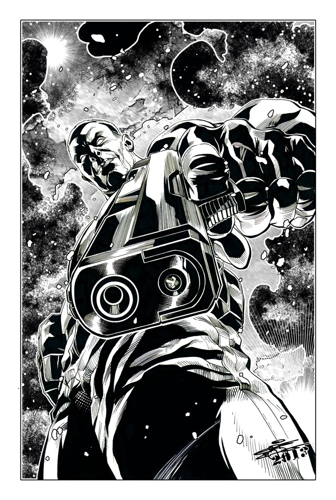
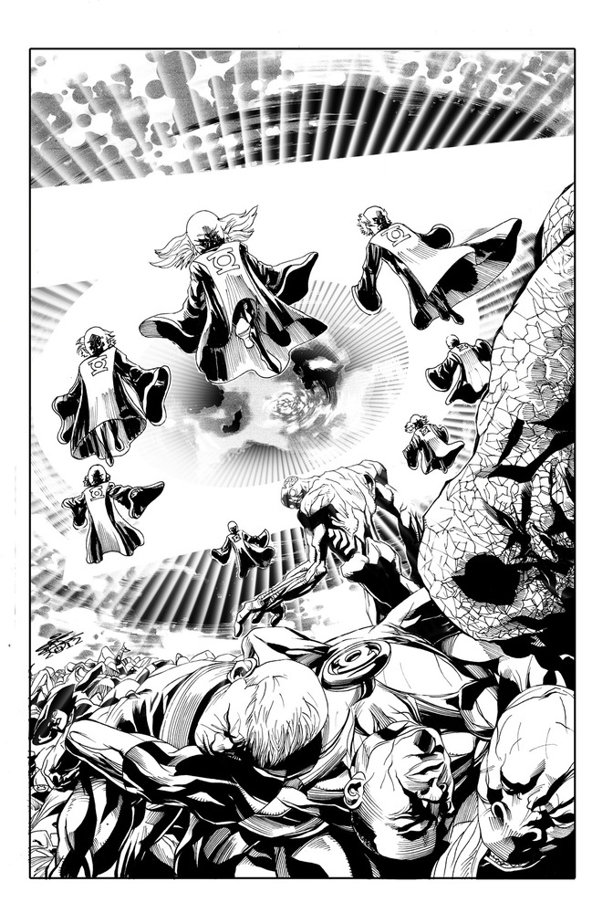
SEVEN: INK THE PAGE. I used severl diffent tools but my mainstay is permanent ink marker pens like Microns ( http://www.sakuraofamerica.com/Pen-Archival) brushpens. Anything that keeps me from having to dip that brush in more liquid ink. Sheesh that stuff gets messy. I move with the times. I tried using crowquills and those things never responded well for me and as patient as i am, i’d rather eat doodoo pie than try to make those things work. I always snapped the points on that thing no matter how gently i used them. Ugh.
EIGHT: After i ink the page to my liking, i scan it one last time… now prepping to set them into two files after i clean theim up with the same technique i used to do the pencils… only easier.
One Is the massive TIFF file, which is usually shot at 400dpi. I’ve sometimes had to set it a 300 dpi for DC and sometimes 600 dpi. Any bigger than that and you’d might as well be drawing on the Empire State Building. After i save the TIFF file, i then reduce the image to 70-100 dpi and turn it into a jpeg. Both pages are either sent by email, if it can fit or i use Dropbox (www.dropbox.com) to link editors to those folders after i put the images there.
It’s a great tool to use.
And you send the vouchers off and wait to get paid, Jack.
BOOM.
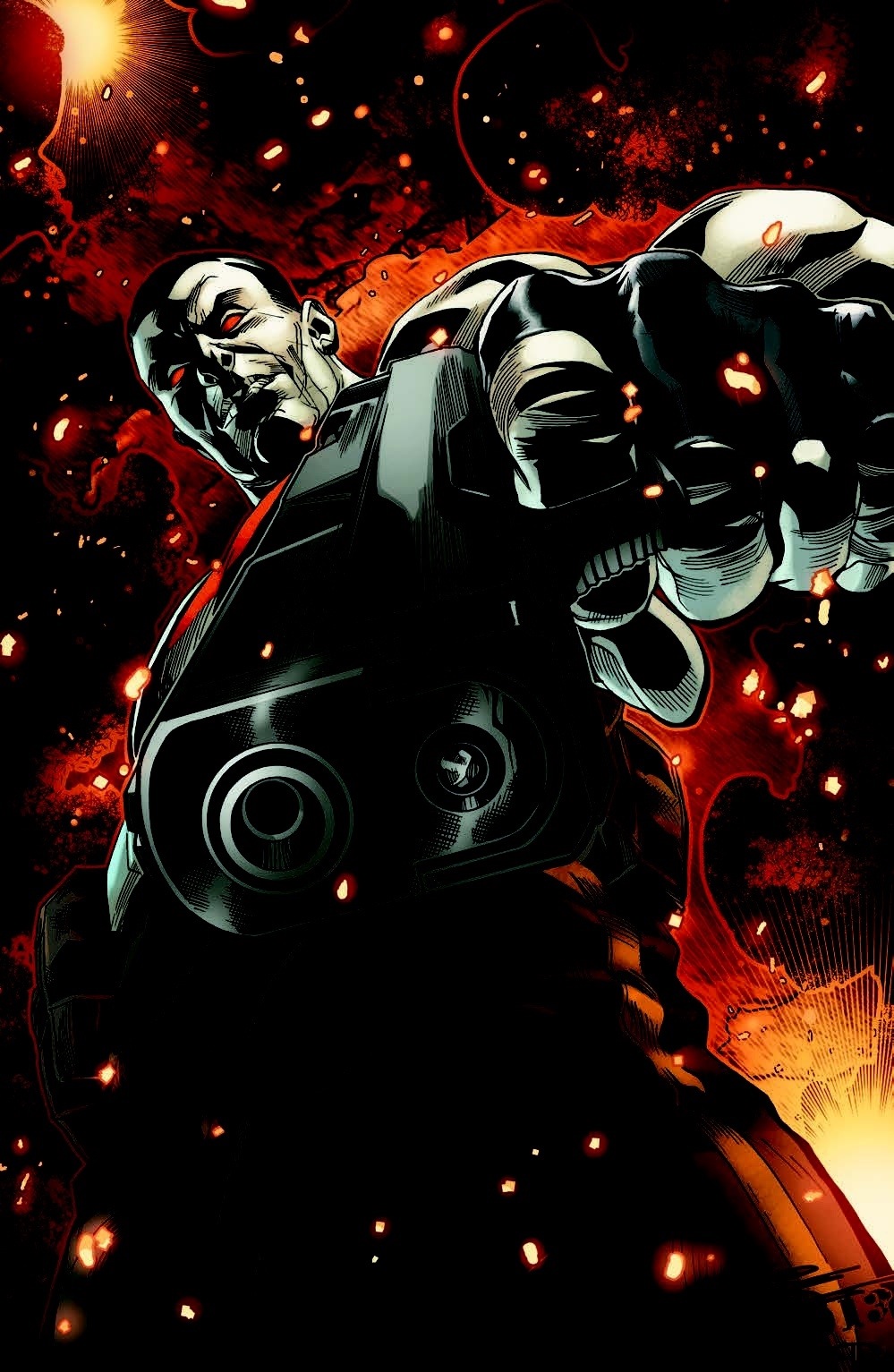
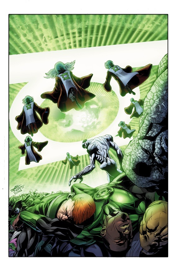
Then the colors by Gabe Eltaeb!
Bonus material, by the way.
Yeah, this was kind of long, but if you persevere through the forest, you learned something, right?
GOOD.
SO … if you still don’t get a thing i just said, pictures are worth a thousand words. And i got progression pics here that should speak-a-plentay. If you don’t know by now, you will never ever know…oo-oo-ooh..
okay, that was just dumb. But you get the idea.
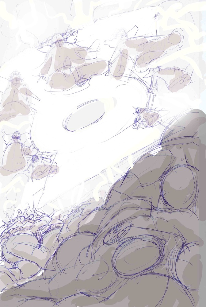
Next posting will be the rest of the images of ths Smallville: Detective concept work.
And stop laughing.
I hear you.